1. Flex布局介绍
FlexBox意为弹性布局,是一种布局解决方案,与传统解决方案(基于盒模型,使用浮动,绝对定位)相比,flex布局更加灵活,具有响应式,可以解决在布局上的很多麻烦。优点如下:
- 方便垂直居中
- 改变元素的视觉次序
- 解决盒子空白问题
- 减少浮动问题
2. 一个简单实例看flex的强大——垂直居中
以往让元素垂直居中并不容易,直到CSS3的出现,使用绝对定位配合translate属性才让垂直居中变得简单,不过还有一个更爽的办法,那就是使用flex,让垂直居中变得异常简单
|
|
几行简单代码,即可让div垂直居中
|
|
这里最重要的就是包裹元素的三个关键属性
display: flex将容器指定为flex布局,任何一个元素都可以指定align-items: center沿交叉轴(下面会介绍)对齐项目,这里指的是垂直方向justify-content: center设置主轴内容对齐方式(下面会具体介绍)
3. 基本概念
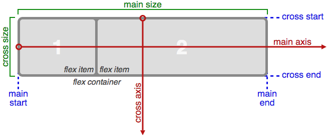
使用了flex布局,则flex容器(flex container),子元素为项目(flex item)
这里最重要的就是理解坐标轴,有两个轴,主轴(main axis),交叉轴(cross axis),start和end表示对应轴的起始位置
这两个轴代表什么取决于Flexbox排列的方向
比如将Flexbox的方向设置为row,则主轴就是横轴,而交叉轴就是纵轴
反之设置成column,则主轴就是纵轴,而交叉轴就是横轴
4. flex容器上的属性使用方法
4.1 flex-direction
定义flex容器的主轴方向来决定felx子项在flex容器中的位置,有四个可选值,分别是row、row-reverse、 column、 column-reverse
flex-direction: row(默认)主轴为水平方向,起点在左端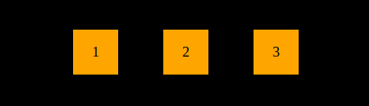
flex-direction: row-reverse主轴为水平方向,起点在右端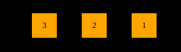
flex-direction: column主轴为垂直方向,起点在上沿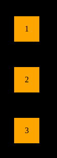
flex-direction: column-reverse主轴为垂直方向,起点在下沿
4.2 flex-wrap
控制flex容器是单行或者多行,同时横轴的方向决定了新行堆叠的方向。三个可选值,分别是nowrap、wrap、wrap-reverse
flex-wrap: nowrap(默认):不换行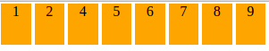
flex-wrap: wrap:换行,第一行在上方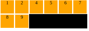
flex-wrap: wrap-reverse:换行并反向,第一行在下方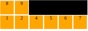
4.3 flex-flow
该属性为复合属性,是flex-direction和flex-wrap的简写
flex-flow: row wrap
等同于
flex-direction: row
flex-wrap: nowrap
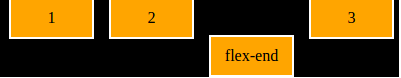
4.4 justify-content
该属性定义主轴上项目的对齐方式,有五个可选值,分别是flex-start 、flex-end 、center 、space-between 、space-around
justify-content: flex-start(默认)左对齐
justify-content: flex-end右对齐
justify-content: center居中
justify-content: space-between两端对齐,项目之间的间隔都相等。
justify-content: space-around每个项目两侧的间隔相等,于是项目之间的间隔比项目与边框的间隔大一倍。
4.5 align-items
该属性定义交叉轴上项目的对齐方式,五个可选值flex-start 、flex-end 、 center 、 baseline 、 stretch
align-items: flex-start交叉轴的起点对齐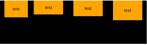
align-items: flex-end交叉轴的终点对齐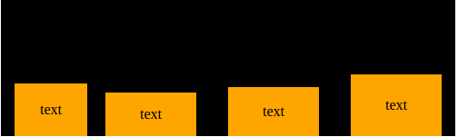
align-items: center交叉轴的中点点对齐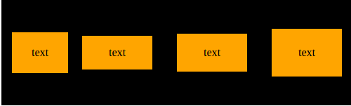
align-items: baseline项目的第一行文字的基线对齐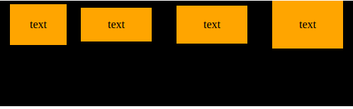
align-items: stretch如果项目未设置高度或设为auto,将占满整个容器的高度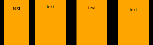
4.6 align-content
属性定义了多根轴线的对齐方式,所以如果项目只有一根轴线,该属性不起作用。可选值有六个,分别是flex-start、 flex-end 、 center 、 space-between 、 space-around 、 stretch
align-content: flex-start与交叉轴的起点对齐
align-content: flex-end与交叉轴的终点对齐
align-content: center与交叉轴的中点对齐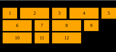
align-content: space-between与交叉轴两端对齐,轴线之间的间隔平均分布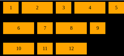
align-content: space-around每根轴线两侧的间隔都相等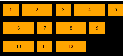
align-content: stretch(默认)轴线占满整个交叉轴
5. 项目的属性
以下属性作用于项目(flex item)
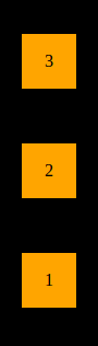
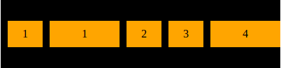
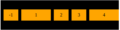
5.1 order
属性定义项目的排列顺序,属性值为整数值,默认为0,数值越大,排列越靠后,数值可以为负数
order:<int>

5.2 flex-grow
如果空间有剩余(即有空白),则使用该属性定义定义项目的放大比例,默认为0
flex-grow属性都为1或者相同,则它们将等分剩余空间
如果一个项目的flex-grow属性为2,其他项目都为1,则前者占据的剩余空间将比其他项多一倍
flex-grow: <number>
{% asset_img 28.png %}
{% asset_img 29.png %}
{% asset_img 30.png %}
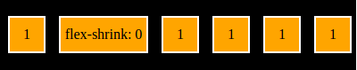
5.3 flex-shrink
flex-shrink属性定义了项目的缩小比例,默认为1,即如果空间不足,该项目将缩小
如果所有项目的flex-shrink属性都为1,当空间不足时,都将等比例缩小
如果一个项目的flex-shrink属性为0,其他项目都为1,则空间不足时,前者不缩小
flex-shrink: <number>
5.4 flex-basis
flex-basis属性定义了在分配多余空间之前,项目占据的主轴空间,它的默认值为auto,即项目的本来大小。
flex-basis: <length> | auto
5.5 flex
该属性为复合属性,即flex-grow、flex-shrink、flex-basis的简写,默认值0 1 auto,后面两个为可选
flex: none | [ <'flex-grow'> <'flex-shrink'>? || <'flex-basis'> ]

flex: auto //等同于flex:1 1 auto
flex: none //等同于flex:0 0 auto
5.6 align-self
align-self属性允许单个项目有与其他项目不一样的对齐方式,可覆盖align-items属性
默认值为auto,表示继承父元素的align-items属性,如果没有父元素,则等同于stretch
可选值有六个,分别是auto 、flex-start 、flex-end 、center 、baseline 、 stretch
除了auto,其余和align-itemss属性一致
align-self: flex-end
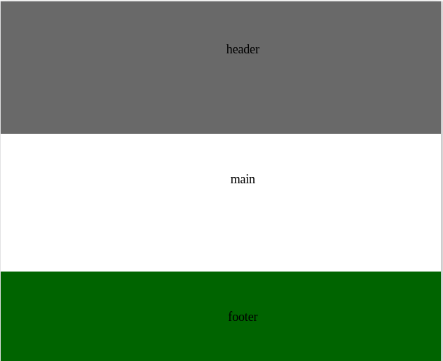
6.简单实例
6.1 使用flex属性解决粘附页脚问题
以往粘附页脚问题处理起来比垂直居中棘手得多,有了flex变得非常容易
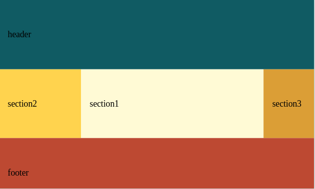
页面结构
|
|
当页面内容不够多的时候,页脚会自动上提
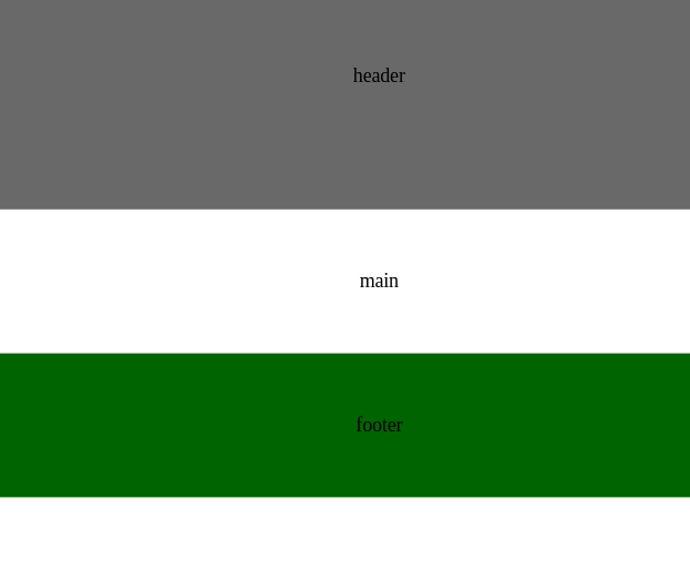
将body设置成flex容器,main标签使用flex:1样式,将会自动填充剩余空白部分
|
|
#### 6.2 改变原始次序
一般用于响应式,在不破坏原始结构的情况下,改变布局
结构
|
|
样式
|
|
增加一个媒体查询
|
|
当大于窗口30rem的时候,呈现的效果是